Designing isn’t all colors and creativity; there are pitfalls that even seasoned designers dread. And trust us, nothing’s scarier than those rookie mistakes that leave clients puzzled and designs looking a little…unsettled. Here’s a list of terrifying design traps that haunt designers and make us double-check everything. Whether you’re learning the ropes or looking for a pro, these are the horrors we work hard to avoid!
1. Trying to Incorporate Too Many Styles in One Graphic
Combining multiple styles can turn a design into a jumbled mess. Think of it like a cocktail—each ingredient needs to complement the others, or you end up with something unpalatable. Consistency in style is key to keeping designs cohesive, professional, and impactful.

2. Using Brand Colors Inconsistently
Brand colors are more than just a palette—they’re a statement. Misusing them dilutes brand identity and confuses audiences. Sticking to consistent color usage across every platform ensures that your brand is recognizable and reliable.
3. Distorting Logos
Stretched or squished logos may look “off,” but they’re also a misrepresentation of the brand. Maintaining the correct logo proportions ensures that it looks sharp, professional, and true to brand standards.
4. The Dreaded Font Explosion
Mixing too many fonts in a single design screams “chaos.” Choosing two to three complementary fonts is all it takes to keep things stylish and polished.

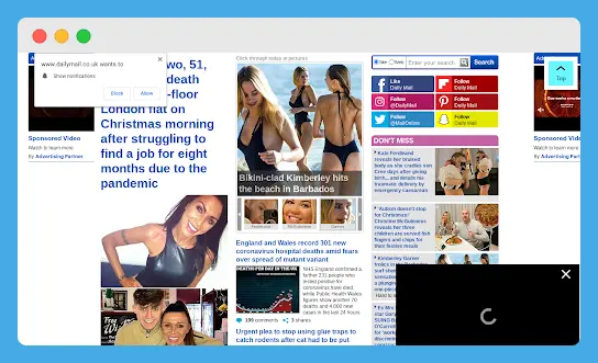
5. Ignoring White Space
Packing too much into a layout? White space isn’t “empty”—it gives designs room to breathe and prevents overwhelming the viewer. Check out the Example below from the Daily Mail. The lack of white space between different sections feels like visual claustrophobia.
6. Using Low-Resolution Images
Grainy, pixelated images can ruin even the best designs. High-quality images add professionalism and clarity; remember, resolution matters!
7. Overcomplicating Animations
Overuse of animations can leave a website feeling more like a carnival ride than a sleek, modern experience. Subtle, purposeful animations are the way to go.
8. Forgetting Hierarchy
Visual hierarchy is a design principle that organizes elements on a page to guide the viewer’s eye in a specific order, from the most important to the least. This is achieved using contrast, scale, color, spacing, and placement. Larger, bolder items at the top of the page, for example, tend to attract attention first.
Take the following picture for example. The author’s name, “Lisa Jackson” should maybe be smaller or placed under the title because the visual hierarchy of the current design makes it seem like “Lisa Jackson Deserves to Die” instead of “Deserves to Die” [Book Title] “Lisa Jackson [author].

9. Overusing Stock Photos
Generic stock images can feel insincere or dated. Custom visuals, on the other hand, add originality and align better with brand identity.
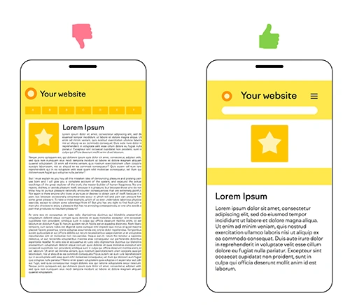
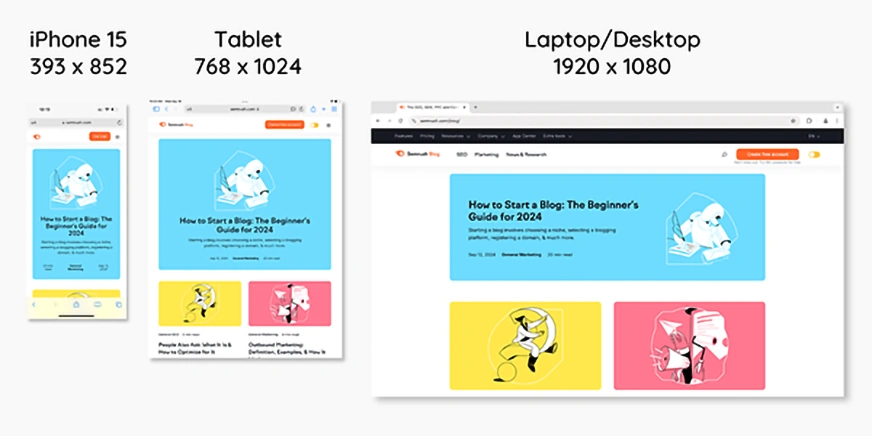
10. Neglecting Mobile Optimization
With so many users browsing on mobile, a non-responsive design loses relevance fast. Making designs mobile-friendly and using responsive web layouts will ensure your website looks good on any screen size.
Feeling the Fear? We Can Help!
Navigating the world of professional design can be tricky, and small mistakes can lead to big problems down the road. Let us take care of the details so you can focus on what you do best. Contact Merveille Creative Studios today, and we’ll handle the rest—no more design nightmares!